January 13, 2016 – Today’s guest blogger is Aaron Foster, a Phoenix, Arizona-based technology enthusiast. He specializes in digital cameras and accessories, Android mobile devices and PC hardware. His topic is about design in the present and future. Comments are welcome.
———-
If something is too complicated, or even gives off the feeling of being too complicated, the average person won’t spend the time to learn it and will take a pass. While this doesn’t mean a product is inferior, if it makes a user’s job harder, then it is not doing its job. The days of having to remember complex DOS commands are long gone. We live in an object world with user interfaces (UIs) that use visuals to increase engagement and allow for quick and easy accessibility. But even now there are plenty of examples of good and bad UIs. In this posting we look at what defines good, bad and ugly as well as where future UI design is going.
Good Design
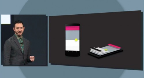
Android is one of two Google operating systems. It rose out of Google initiatives related to smartphones. Since its first release it has evolved to be multi-platform to fit different form factors, from small to large screens.The latest Android style guide is called “Material Design.” The UI is based on the principle of “quantum paper” and three-dimensional representations of objects. Design elements are suspended over each other and shadowing creates a look as if the elements are layered one physically above another. The idea is to create a UI that emulates paper and books, a user experience most understand. The team at Google actually has made “real” representations of their icons and screens to get a better idea of how lighting and shading interact. The thought process behind these representations is to create a simulation of a user holding a book.
A wholesale rethinking of UI design, similar to what Google has done ensures users can start a task on a desktop, then later use the same application on a phone, and not notice anything different in the UI. This interoperability at its best. And because so many software developers are now present in both the mobile and desktop worlds, this kind of simplified UI makes it easy for users to seamlessly switch. Expect to see far more of this in the future.
Bad Design
Simpler UIs have become more popular for the last few years but there are some websites that haven’t yet read the memo. It is hard to single out one site but easy to define many of the common features found in bad UI design.
For example, when the Internet was younger a cluttered web page seemed to be all the rage. While much of page and site designers have moved away from clutter, news services like Fox seem to want to keep it around. A well designed UI should allow the user easy access to the flow of information. Instead many distract a site visitor using pictures and bright colors drawing the eye to main topics but simultaneously surrounding them with clutter and links often irrelevant to those stories. This crowding of information makes it difficult to see what’s important and what’s not, and navigating the site becomes confusing.
To defeat this “all the news fit to print” approach is simple. Make every story stand out independently in its own space. Tech blogs do a better job of this. Why? Because the designers understand that their readers may be viewing their content from a variety of form factors, from small mobile screens to large desktops. Tending to the lowest common denominator means making the UI work optimally on the smallest form factor, a smartphone screen. This is a minimalist approach to UI. Instead of multiple columns, tech blogs focus on a central or single column format where all the essential information flows down the page. Readers can scroll to the end of a posting without any sidebar distractions. As mobile devices become increasingly popular in the future, news sites will have to make the adjustment to this minimalist approach or find themselves losing audience to news bloggers.
What Bad Design Teaches Us
To design a better UI developers have to understand their audience. They also have to understand the form factor. Google’s Material Design provides a clear UI hierarchy based on real-world models (i.e. a book) and thus feels familiar. Bad web design fails to create a unifying element that provides comfort to the site visitor.
Designs don’t have to be complex to be good. In fact, oftentimes a simpler design is better. Appliances, for instance, have a clear purpose in mind. Your washing machine isn’t going to ask how your day is going. Rather it only has a few relevant settings that pertain to how much cleaning your clothes need. Clutter is the natural enemy of intuition and when a designer tries to cut that out, everyone benefits.
But even today as appliances become more digital, manufacturers are being criticized for increasingly complicated design features with programmed elements and tiered menu choices. It would be better for manufacturers to understand the less-is-more rule of design and balance advanced features with a simple, intuitive UI. Washing and drying clothes shouldn’t be complicated.
The Future of Design
What’s coming down the pipe in UI design? Holography and 3D, and virtual reality and simulation. 3-D displays may put an end to the 2-D design with objects represented three dimensionally. Expect, however, that the use of real-world analogs will be critical to making UIs intuitive. Imagine interacting with a virtual object in a UI that you can physically grasp. The recent development of the HaptoClone described in a January 2nd posting on this site is the forerunner of how we will interact with applications and devices in the not too distant future.


